
Transform Your Home With These Easy Interior Design Ideas
A blank, lifeless room can drain your energy before you even sit down, yet interior design transforms raw space into a purposeful sanctuary that works for how you actually live. It is the deliberate arrangement of light, proportion, texture, and color to guide movement, boost mood, and make every square foot earn its keep. By layering function with aesthetic intent, you turn a house into a daily tool for comfort, focus, and effortless flow.
What Does a Interior Designer Actually Do for You?
An interior designer turns your messy ideas into a workable plan, starting by measuring your space and asking the right questions about how you actually live. They handle the nitty-gritty—like creating floor plans, specifying materials, and coordinating with contractors—so you don’t have to juggle calls or worry about paint colors clashing with your sofa. They save you from costly mistakes by knowing what will fit, what will wear well, and what will look cohesive before you spend a dime. They also manage the project timeline, ordering furniture and tracking deliveries so everything arrives in the right order. You still make the final calls, but they translate your vague preferences into concrete choices you’d never think of yourself. Ultimately, they give you a space that feels intentional, not just decorated, while protecting your budget and your sanity.
How They Turn Empty Rooms Into Functional Living Spaces
An interior designer starts with a spatial plan, mapping traffic flow and zoning each area for specific daily activities. They then layer in ergonomic furniture placement, ensuring clear pathways and comfortable proportions. Lighting is strategically layered—ambient, task, and accent—to support different functions, from cooking to reading. Storage solutions are built into underutilized corners, while material and color choices define distinct zones without needing walls. Through this, they establish functional living spaces from blank shells, prioritizing how the room will be used over decoration alone.
- Measure and allocate zones for cooking, dining, working, or relaxing
- Specify multi-purpose furniture that adapts to changing needs
- Install task lighting at key activity points to reduce eye strain
- Integrate vertical and hidden storage to keep surfaces clear
The Difference Between Decorating and Designing a Home
Decorating is the finishing layer—choosing cushions, art, and paint colors. Designing is the strategic overhaul of how a space functions, flows, and feels. A decorator works with what exists; a designer reconfigures walls, lighting, and circulation to solve how you live. The difference between decorating and designing a home is structural thinking versus surface styling. Design addresses awkward layouts, poor natural light, and traffic patterns before any aesthetic choice. Decorating applies polish afterward. You hire a designer when you need spatial problem-solving, not just a prettier room.
- Design changes the floor plan; decorating changes the furniture arrangement.
- Design plans electrical, plumbing, and built-ins; decorating selects movable objects.
- Design starts with function and lifestyle; decorating starts with color and texture.
- Design affects resale value; decorating is easily swapped out.
How Do You Start Planning a Room Redesign from Scratch?
Start by defining the room’s non-negotiable function, then measure every wall, window, and doorway to create a scaled floor plan—this becomes your absolute decision-making filter. Next, pin down a single anchor piece (a sofa, rug, or statement artwork) and derive your entire palette and material story from it, ensuring cohesion without guesswork. Before buying anything, map circulation paths with painter’s tape on the floor; if you can’t walk through naturally, the layout fails. Designing from scratch means embracing the awkward first sketch, because that’s where you discover what to ruthlessly cut. Finally, build a priority list: lighting, storage, and seating before decorative layers. This sequence prevents costly impulse mistakes and turns an empty box into a deliberate, layered space that works from day one.
Key Questions to Ask Before You Pick a Single Paint Color
Before you fall for a swatch, interrogate the light. Ask how the room’s natural versus artificial light sources shift the hue from morning to evening. Question your furniture’s undertones—will a warm beige clash with a cool gray sofa? Consider the room’s purpose: does a high-traffic hallway need a scrubbable finish, or a bedroom a matte retreat? Then, test the paint against your largest fixed element, like flooring or cabinetry, to ensure harmony. Finally, ask yourself how the color makes you feel in a digital mockup versus a real-life sample—one often lies.
| Light Condition | Color Behavior | Key Question |
|---|---|---|
| North-facing | Cool, shadowy | Will this feel too cold? |
| South-facing | Bright, warm | Will this wash out? |
| Evening lamps | Yellow cast | Does it turn muddy? |
Measuring, Mapping, and Visualizing Your Layout Options
Start by recording precise wall lengths, window heights, and door swings on graph paper, then transfer those numbers into a free room-planning app to test layouts virtually. Next, cut out scale furniture templates—or use digital blocks—and slide them around to see traffic flow and clearance zones without lifting a single sofa. For true spatial confidence, tape painter’s lines directly on the floor to outline each proposed zone, then walk the paths you’d take daily. This hands-on approach reveals bottlenecks and awkward corners before you commit. Finally, photograph the room from multiple angles and overlay your sketched plan to visualize sightlines and focal points. Accurate spatial mapping prevents costly furniture mismatches and wasted effort.
Q: What’s the fastest way to test a layout without moving furniture?
Use smartphone AR measurement tools to mark walls and doorways, then drop in 3D furniture models—this gives instant scale and depth feedback for every option.
What Are the Core Elements That Make a Room Feel Put Together?
A room feels put together when a clear visual weight hierarchy anchors the space, starting with a deliberate focal point—whether a fireplace, art piece, or bold sofa—that everything else supports. Consistent color repetition (at least three times per hue) ties disparate objects into a cohesive story, while varied lighting layers (ambient, task, accent) add depth and prevent flatness. Proportional spacing matters: furniture should breathe, leaving clear pathways, yet grouped for conversation. Texture contrast—rough linen against sleek metal, nubby wool with smooth leather—prevents monotony. Editing ruthlessly is the final glue: every item must earn its place by function or sentiment.
True polish emerges not from adding more, but from subtracting until only intentional, balanced pieces remain.
Finally, a unifying rug defines the seating zone, and window treatments that skim the floor elevate perceived height, completing the curated, unhurried composition.
Balancing Light, Proportion, and Focal Points Effectively
Think of a room like a conversation—it needs a clear lead voice, a good rhythm, and just the right volume. **Balancing light, proportion, and focal points effectively** means letting one hero piece (like a bold sofa or a dramatic fireplace) anchor the space, then using lighting to sculpt the mood around it. You don’t want every element shouting; instead, layer ambient light with task lamps to guide the eye, and keep furniture scaled to the room’s footprint—too big feels clunky, too small feels lost. Aim for a natural flow where sightlines land on something intentional, while shadows and negative space give the whole scene room to breathe.

Using Texture and Layering to Add Depth Without Clutter
Texture and layering create depth by engaging touch and sight without introducing new objects. Pair a rough jute rug with a smooth linen sofa, then add a chunky knit throw to introduce contrast that feels intentional. Layer materials vertically—wood, metal, glass—but limit each category to two or three pieces per zone. Repeating one texture in varying scales, like a velvet cushion and velvet lamp shade, unifies the scheme while preventing visual noise. Reserve high-contrast textures for focal points, and let neutral finishes recede to maintain breathing room. The goal is dimension through tactile variety, not accumulation. Strategic textural contrast replaces decorative excess.
Effective layering prioritizes tactile variety and material repetition, so depth emerges from thoughtful contrast rather than added items.
How to Choose a Cohesive Color Palette That Suits Your Lifestyle
Choosing a cohesive color palette starts with auditing your real life, not just Pinterest boards. Anchor your scheme in your daily rhythms—if you work from home, opt for muted, grounding tones like sage or clay to reduce visual noise, while a social host thrives with warm terracottas and jewel accents that energize a dining space. For high-traffic families, select saturated mid-tones that disguise scuffs, then layer in lighter tints only on removable textiles. Test colors at different hours, because morning sunlight shifts your perception.
The most cohesive palette is one that whispers your routine back to you, from your morning coffee spot to your evening wind-down corner.
Finally, commit to a 60-30-10 rule: dominant wall color, secondary furniture tone, and a bold accessory hue that you genuinely love using—not just looking at.
Simple Rules for Mixing Neutrals with Accent Shades
Start with a dominant neutral—warm greige, soft taupe, or cool gray—covering roughly 70% of the room, then layer one accent shade at 20% and a micro-pop at 10%. The critical rule is to anchor your accent in the same undertone family as the neutral; a warm beige demands a terracotta or olive, never a stark blue. Test three shades of the accent against your neutral in natural light before committing. A single muted accent, used deliberately, always reads more sophisticated than three clashing brights. This ratio prevents visual chaos while letting your chosen hue breathe. Cohesive accent placement works best on textiles, one feature wall, or small decor objects, keeping large surfaces consistently neutral. Your lifestyle dictates the accent’s intensity: high-traffic families choose deeper, stain-tolerant shades; minimalists select a quiet dusty tone.
- Limit to one primary accent; use it in at least two distinct spots for rhythm.
- Match the accent’s saturation to the neutral’s depth—dark neutrals need richer accents.
- Use the 70-20-10 rule for every room to guarantee balance.
- Always sample the accent on the actual wall—never trust swatches alone.
How Natural Light in Each Room Should Influence Your Choices
Before you commit to any paint swatch, watch how sunlight moves through each space. A north-facing room with cool, muted light will make deep navy or charcoal feel moody and cavernous, whereas the same shades can feel grounding in a bright, west-facing den. For rooms bathed in warm afternoon glow, lean into earthy terracottas or creamy whites to amplify that golden hour effect. Conversely, darker powder rooms or hallways benefit from lighter, reflective tints that bounce what little daylight exists. Test your top three colors on large boards and observe them at 9 a.m., noon, and dusk—this direct comparison reveals which undertones truly harmonize with your home’s unique light-driven color palette.
- Use warm, saturated hues in south-facing rooms to embrace constant sunshine.
- Choose soft, airy pastels for east-facing bedrooms to balance sharp morning rays.
- Add warm neutrals to west-facing spaces to soften intense late-day glare.
- Pick high-reflectance whites for north-facing rooms to prevent a flat, gray feel.
Where Should Your Budget Go First in a New Design Project?
In a new interior design project, your budget should first secure the **structural and functional backbone** of the space—things like electrical rewiring, plumbing, and built-in storage, since these are costly and disruptive to change later. Next, allocate funds to **high-impact, permanent surfaces** such as flooring and wall finishes, because they define the room’s visual weight daily and are expensive to replace. Only after these are locked in should you spend on furniture, prioritizing a few quality anchor pieces over many decorative accessories. *A common misstep is buying a statement sofa before confirming the ceiling can support new lighting or that the floor is level.* Leave a 10–15% contingency for unexpected issues like drywall damage or outdated subfloors, which almost always surface once construction begins. Finally, postpone art, rugs, and soft textiles until the core systems and finishes are paid for—otherwise, you risk compromising safety or durability for aesthetics.
Investing in Furniture Pieces That Anchor the Whole Space
When your budget is tight, resist the urge to scatter funds across decor—instead, channel everything into anchor furniture investments like a solid sofa, a substantial dining table, or a carved bed frame. These pieces visually lock the room’s layout and set its material story, so a worn rug or bare wall fades into background noise. Choose one hero item with timeless lines and durable upholstery, then let smaller purchases wait until that foundation exists. A thick oak table or a deep, low-profile lounge chair will define traffic flow and scale, making the entire space feel intentional overnight. Proportion matters more than trend here.
Q: Should you buy the anchor sofa first, even if it leaves nothing for a coffee table?
A: divine home Yes—a capable sofa grounds sightlines and seating, while a temporary crate or folded blanket can stand in until your next funding round. The anchor is non-negotiable; everything else is negotiable.
Smart Ways to Save on Accessories Without Losing Style
Before allocating your budget, prioritize large surfaces and fixed elements, but when addressing accessories, adopt a curated scarcity approach. Instead of filling every shelf with impulse buys, invest in a few high-impact statement pieces like a sculptural vase or a hand-woven throw that anchor the room’s color story. Shop for texture over trend: plain linen cushions in neutral tones cost less but mimic the tactile luxury of designer velvet. Repurpose functional items as decor—stack leather-bound books, display ceramics from your kitchen, or cluster candles at varying heights to create visual rhythm without purchasing new objects. Thrift and vintage stores offer unique brass hardware or art frames that you can spray-paint for a cohesive finish. Finally, rotate accessories seasonally using what you already own, ensuring freshness without additional spending.
Smart saving on accessories means buying fewer, bolder pieces, reusing existing objects creatively, and prioritizing texture and proportion over brand or trend.
What Common Design Mistakes Are Easy for Beginners to Avoid?
Beginner interior design projects often stumble on a few predictable issues. The most common mistake is pushing furniture against every wall, which creates a cavernous, disconnected feeling; instead, float pieces closer together to foster conversation. Another frequent error is hanging art too high—eye level is the standard, not near the ceiling. Beginners also overlook scale, buying a sofa that overwhelms a small room or a rug that floats like an island. A rug should anchor the seating group, with at least the front legs of furniture on it. Finally, avoid matching every item in a set; identical furniture suites look stiff, whereas mixing textures and wood tones adds depth. Easy mistakes to avoid include ignoring lighting layers—relying on a single overhead fixture is harsh, so add lamps and sconces for warmth.

Why Pushing Furniture Against Every Wall Feels Uninviting
Pushing every sofa, chair, and table against the wall creates a cold, fragmented seating layout that kills natural conversation flow. When furniture lines the perimeter, the room’s center becomes a dead void, forcing you to raise your voice or lean awkwardly across space. This arrangement also pushes traffic through the middle, making the area feel like a waiting room rather than a living space. Pull pieces toward each other to form intimate clusters—float a sofa two feet from the wall, angle chairs toward a coffee table. The empty zone behind a pulled-out couch becomes intentional breathing room, not wasted centimeters. For a balanced room: measure your clearance, anchor one focal point (fireplace or console), then position seating around that axis, leaving at least three feet of walkway behind furniture.
Choosing Rug Sizes and Lighting Heights That Actually Fit
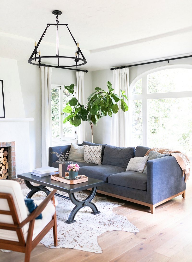
Choosing rug sizes and lighting heights that actually fit prevents the most visible beginner errors. A rug should anchor the main seating zone, with at least the front legs of sofas and chairs resting on it; an oversized rug extending under all furniture looks more intentional than a small “postage stamp” floating mid-room. For lighting, hang pendant or chandelier bottoms 30–36 inches above a dining table, and bedside fixtures 20–24 inches above the mattress. Follow this sequence: measure the room’s primary furniture footprint, add 24 inches to each side for rug width, then adjust light heights based on the table’s surface or bed frame. Correct scale and clearance eliminate the awkward gaps and crowded feels that mark amateur spaces.